The Innovative Use of Colour: Unlocking the Secrets of Colour Theory for Successful Print Design
Colour plays a pivotal role in how we perceive and respond to visual stimuli. The right combination of colours can evoke emotions, convey messages, and create lasting impressions. In the world of print design, understanding and using colour effectively is crucial for achieving the desired outcome. In this post, we'll explore the innovative use of colour, delve into colour theory, and discuss shading, tones, and embellishments that can elevate your print projects.
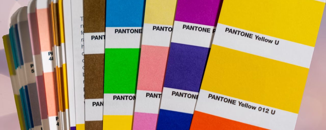
A Splash of Colour Theory
Colour theory is a set of principles and guidelines used to understand how colours work together and the emotions they can evoke. Let's look at some basic concepts:
- Primary, Secondary, and Tertiary Colours: Primary colours (red, blue, and yellow) can be combined to create secondary colours (green, orange, and purple). Mixing primary and secondary colours results in tertiary colours, like red-orange and blue-green.
- Complementary Colours: Colours that are opposite each other on the colour wheel, like blue and orange or red and green, create high contrast and can make your design pop.
- Analogous Colours: Colours that are adjacent on the colour wheel, like blue, blue-green, and green, create a harmonious and visually pleasing effect.
- Triadic Colours: A combination of three colours evenly spaced around the colour wheel, like red, yellow, and blue, can create a vibrant and balanced design.
Choosing Colours with Purpose
To create a successful print piece, it's essential to consider the emotions and messages you want to convey. Colour psychology can help guide your choices:
- Blue: Often associated with trust, loyalty, and stability, blue is commonly used by banks, tech companies, and healthcare providers.
- Red: This powerful colour evokes energy, passion, and urgency, making it a popular choice for sales promotions and attention-grabbing designs.
- Yellow: Representing warmth, happiness, and optimism, yellow can inject positivity and energy into your print materials.
- Green: Associated with growth, nature, and tranquillity, green is perfect for eco-friendly businesses, wellness brands, and calming designs.
- Purple: Symbolising luxury, creativity, and mystery, purple can make your design stand out and add a touch of sophistication.
Shading, Tones, and Embellishments
To further enhance your design, consider the use of shading, tones, and embellishments that complement your colour choices:
- Shading: By using different shades of the same colour, you can create depth and visual interest in your design. Experiment with lighter and darker shades to find the perfect balance.
- Tones: Tones are created by adding grey to a colour, resulting in a more subdued and sophisticated hue. Using tones can make your design appear more refined and professional.
- Embellishments: Adding special finishes like foil stamping, spot gloss, or embossing can accentuate your colour choices and create a luxurious touch. Choose embellishments that complement your colour palette and reinforce the message you want to convey.
Conclusion
Unlocking the power of colour can significantly impact the success of your printed materials. By understanding colour theory and its psychological effects, you can make informed choices that resonate with your target audience and help achieve your desired results. Don't be afraid to experiment with shading, tones, and embellishments to create a truly innovative and eye-catching design. With a little knowledge and creativity, you can master the art of using colour effectively in your print projects. LOTSA Print is your ideal partner to bring your colourful creations to life, offering high-quality printing and a range of finishing options to ensure your designs shine. Let LOTSA Print be the canvas for your vivid visions, and together, we'll make your projects a colourful success.

